Performance UI
A design system written for agents
Performance UI is a design system written for agents. It gives an agent the colours, sizes, motion and page budgets for fast interfaces, with the reason behind every rule. I made it from 141 decisions in a picker I built, along with Looks UI, the layer this site uses on top of it.
- When
- 2026
- Role
- Design and writing, solo
- Price
- Free
The problem
Coding agents build interfaces from memory, so every page drifts towards the same generic look, and nobody checks how heavy or slow it is. I wanted one set of rules an agent loads before it touches any UI.
- SKILL.md33 hard rules on one page
- references/13 files: the value, the reason, the source
- tokens/tokens.jsonEvery value, in one place
- tokens/budgets.jsonWeight and speed targets
- specimen.htmlThe system on one page
Decision 1
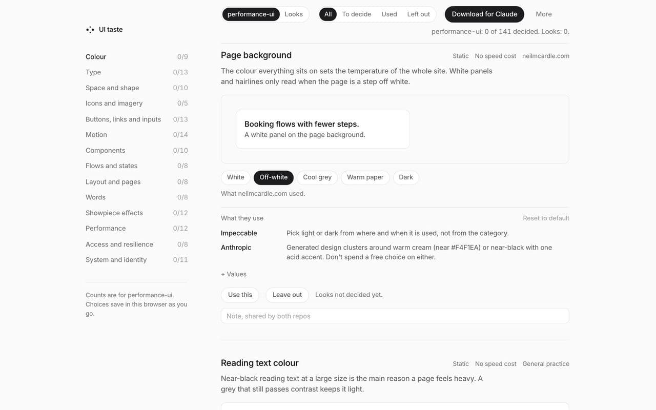
Decide by looking, not by remembering
I built a picker with 141 decisions in 14 areas. Each one has a live demo, dials for the exact value, what it costs in speed and where the idea came from. I set every value by eye, not from memory.
Instead of writing rules from memory, which drift towards whatever is fashionable.
Decision 2
One set of choices, two systems
Each decision gets an answer for a fast site and an answer for a site where the impression matters most. Performance UI is the fast one. Looks UI sits on top of it and changes only the 33 decisions where the answer differs, like a dark page or one showpiece effect.
Instead of one system that tries to be fast and expressive at once, and is neither.
- Looks UI33 decisions that change when the impression matters most
- Performance UI129 decisions for fast, calm interfaces
Decision 3
Short rules first, detail on demand
The agent reads 33 hard rules on one page. Each area has its own reference with the value, the reason and the source, and the agent opens only the one it needs.
Instead of one long style guide that an agent has to read in full, and skims.
Decision 4
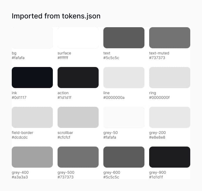
One source for every value
Every colour, size, space and duration lives in one file. A script writes the CSS variables and the Tailwind theme from it, and the same file imports into Figma as variables.
Instead of values copied by hand into code and Figma, drifting apart.
tokens.json
The build script writes tokens.css and theme.css from it.
Imported into Figma, it becomes 77 variables in four collections.
Decision 5
Budgets an agent can check
Page weight, JavaScript, requests and speed targets are stored as numbers, so an agent can measure a page against them rather than judge it by eye.
Instead of advice like keep it fast, which nobody can check.
Decision 6
Name the defaults to avoid
A banned list names the moves that make a page look generated, so the agent avoids them on purpose rather than by luck.
Instead of hoping good taste comes through on its own.
- Gradient text
- Glass and blur as decoration
- Tracked capital labels
- Emoji standing in for icons
- Arrows on every button
- Fade-up on every section
- Em dashes in copy
The proof
One brief, with and without
A booking page for a made-up rail company, built by Claude twice from the same brief: once on its own, once with Performance UI loaded. This is a demo, not client work.


What changed
Without the rules, the agent still made a good-looking page, but it led with the fare and added the fee at checkout, used nine type sizes and loaded its font from Google. With them, it showed the total first, kept to five sizes and one font file. It also left three 36px buttons below the 44px tap size the rules ask for, so the next version gives buttons a bigger tap area.
| Rule | Without | With |
|---|---|---|
| Price people see first | The fare, with the £2 fee added at checkout | £41 total, with fare and fee underneath |
| Type sizes | Nine, five of them off any scale | Five, all on the scale |
| Fonts | Loaded from Google, two outside hosts | One file, served with the page |
| Details joined with middle dots | Yes | No |
| Buttons and links under 44px | 6 of 15 | 3 of 5 |
The proof, with Looks UI
One launch page, three ways
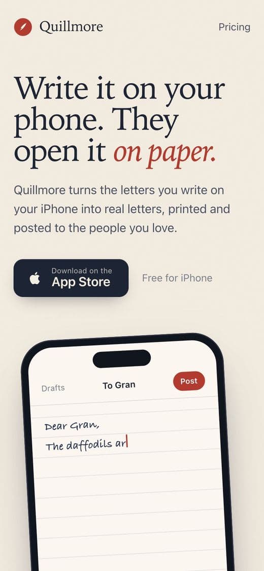
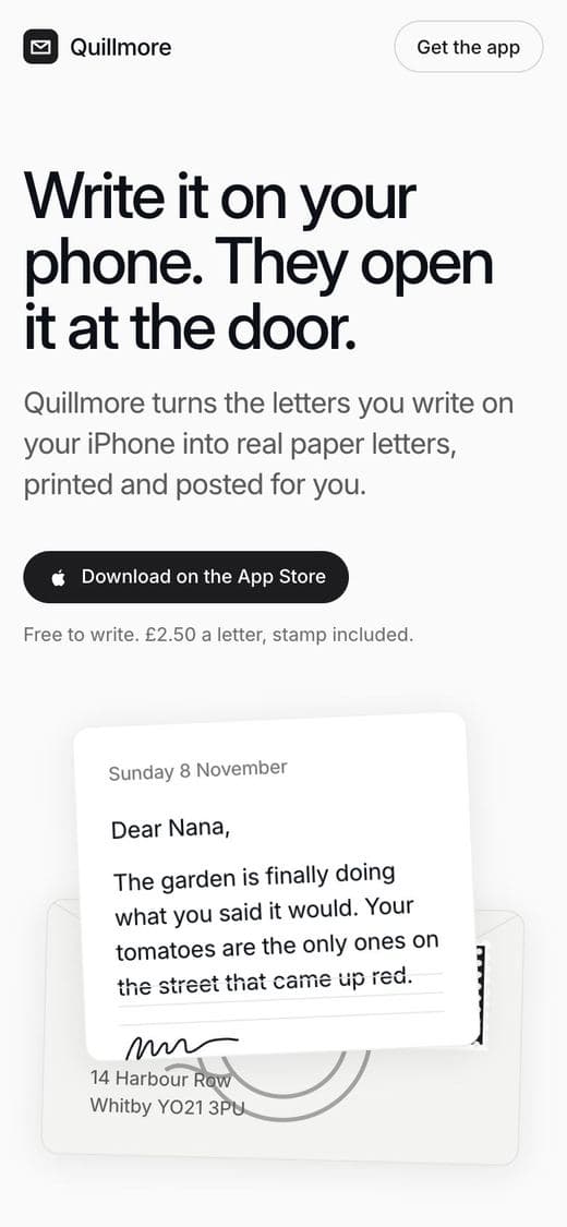
A launch page for a made-up app, built by three agents from the same brief: one with no skills, one with Performance UI, one with Performance UI and Looks UI. The same speed rules sit under the last two; Looks UI only changes how it feels.
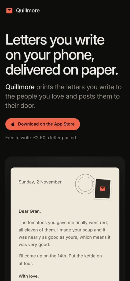
What Looks UI changed
Without skills, the agent reached for a cream page with a red accent, one of the banned defaults, and faded every section in. Performance UI made it calm and fast but plain. Looks UI kept the speed and gave it a dark page, one brand colour, edges instead of borders and a single showpiece. Both rule-guided pages still made some buttons smaller than the 44px the rules ask for, so that rule needs to be stricter.
| Rule | No skills | Performance UI | With Looks UI |
|---|---|---|---|
| Page | Cream with a red accent | Light, ink only | Dark, one brand colour |
| Typefaces | Three | One | One |
| Type sizes | 18 | 5, all on the scale | 5, all on the scale |
| Borders | 9 | 3 | None, shadows instead |
| Scroll motion | Every section fades up | None | None |
| Showpiece | None | None | One, paused off screen |
| Buttons under 44px | 2 of 4 | 4 of 5 | 1 of 2 |
Credits
Whose ideas these are
Most of the ideas came from people whose work I admire, and every decision in the picker names its source. The numbers count how many of the 141 decisions each source informed; some cite more than one. I set every value myself, so a source means the idea came from them, not that I copied their rules. Jakub Krehel's article on shadows instead of borders shaped the edges in Looks UI.
| Source | What I took | Decisions |
|---|---|---|
| Impeccable | Paul Bakaus's design skill | 37 |
| My own work | This site, my product brands and my writing rules | 32 |
| Apple | WWDC talks and the Human Interface Guidelines | 27 |
| Emil Kowalski | His writing on motion and interaction, and Sonner | 20 |
| frontend-design | Anthropic's design skill | 15 |
| Wireframe and Inflight | Their sites, for type sizes, columns and controls | 15 |
| Vercel | Web interface guidelines and React rules | 12 |
| web.dev, WCAG and Core Web Vitals | Speed and access | 11 |
| break-ui, mobile-native, animation-performance and pick-ui-library | Agent skills built on Emil Kowalski's design engineering, author unknown | 10 |
| Baymard Institute | Forms and checkout research | 4 |
| Studio sites and torph | Showpiece effects | 4 |
| Robert Bringhurst, Brilliant and the CMA | Type scale, first run and price rules | 3 |
What I led
All of it: the picker, both systems, the rules, the references, the tokens and the specimen page, each rule picked one at a time and credited to its source. This site follows both, and the picker is free to try.